4-2 : Two Approaches to a Simple Design
Designing for your Audience
So far in this course you've designed some items that could be applied to business clients large and small. This tutorial will take a look at something simpler and very common. Most graphic design is used to sell something. When you have an item for sale, you need to consider two things - who your audience is and where will you market it. This tutorial will presume that you have to sell something. You can make it simple or take a bit longer and add some flair and make it look more professional.
Designing a Simple Flier
Think of a bulletin board at a small grocery store, it's not very crowded, and it's glanced at as people enter the store. If someone does notice it, it better be quick and easy to read - People are busy, they aren't there to read something in passing. So it needs to grab their interest and now.
Here are my design criteria for this project:
Bold
Simple, complete information
Big Photo
Any good flyer should have a good photo. It should show the item clearly and be "worth a 1000 words". Most of this tutorial will use familiar tools from the other tutorials, but is more an exercise of looking at the same project two different ways.
Here is a simple design that you might use:
Does it get much simpler than that? But, it is still a "Graphic Design". I had to consider the item, the placing of the design and the intended audience. In this case, I'm dealing with people who might just glance at the flyer for less than a second. I used concise details, a bold header, simple description. I also included the price and the contact info on the flyer, so people know who to call.
Let's break it down:
I used a layer of simple bold text, not fancy, and easy to read for the Title Header on top. (Refer to Tutorial 1-12 to review this tool)
A large photo that's easy to see, is placed in the middle and a border is added using the "Blending Options>Stroke" (Refer to Tutorial 2-6 to review this tool)
A block of simple bold text is added underneath the picture to describe the item for sale. (Tutorial 1-12)
Another text layer is add for the price. Bigger, bolder, more prominent so that it will stand out! (after all this is a great price! Tell everyone about it!) We separate the price out because it is easier to change the size if it's by itself on a separate layer.
Send to print!
Designing a Professional Flier
So, you picked up a carton of tape measurers for a great price and want to sell them. You need to design a flyer that has more of a professional look. You would use the same basic criteria for your flyer as you did before. Though you'll want to add a bit of flare to it... because you are a professional, right? Note the differences..
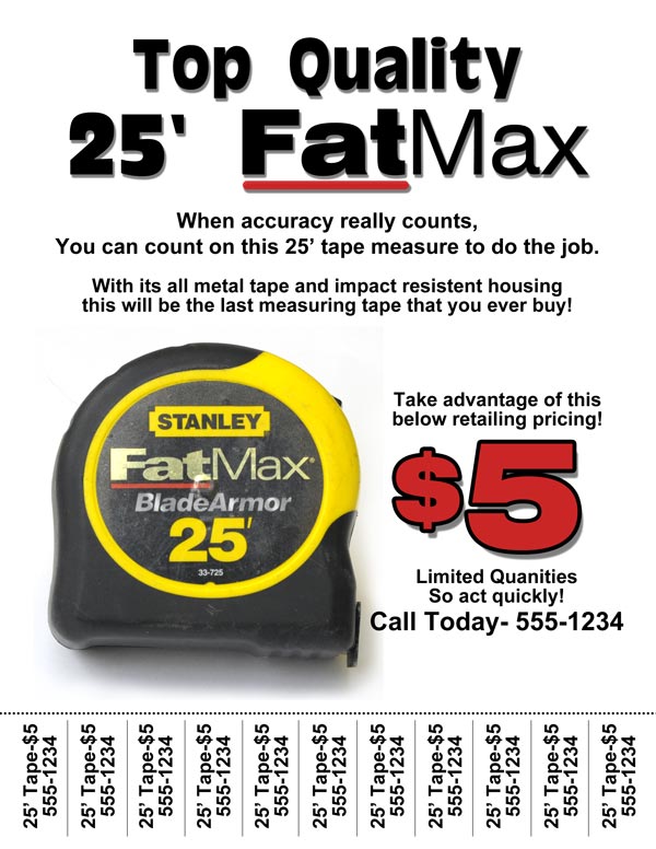 A little more complicated but so much more professional looking. I used a phone number 'tear-off' with the item and price on it (so once it's torn off, people will remember what it is) for contact as most people won't want to stop and call me when they're in the middle of running errands. Again, I used concise details, I included the price, and the contact info on the flyer it's self, JUST in case all the little tabs get torn off and no one calls, someone can still contact me! (that's thinking ahead) I used text that is similar to the logo, in the header to help advertise the brand identity (FatMax) of the product. I rearranged some things and added drop shadows to make the overall layout more dynamic. Included some product "Hype" and added a sense of urgency to call right away because I have "Limited Quantities".
Let's break it down:
I used 2 layers of simple bold text, not fancy, and easy to read for the Title Header on top. Putting the Header (25' FatMax) and Sub-Header (Top Quality) on separate layers allows you to adjust the sizes individually. Though you could have them on the same layer and adjust the size and font of each letter or word or even line, independently. Sometimes this is easier, but in this case, it is not. However, I did change the font for the word "Max" to one that matches the product logo more closely. (Refer to Tutorial 1-12 to review this tool) I then added a red line underneath the word "Fat" for the same reason. Stanley's marketing department put a lot of time and effort into making sure that their consumers recognize their brands, take advantage of it when you can.
In this flyer, I took the border off of the image and using the "Eraser Tool" (Tutorial 1-8) I blended the hard edge to make the image look as if it were part of the page instead of sitting on top of it. The easiest way to do this is to select the "Eraser Tool" (Shift +E) and adjust the brush to a size that will allow you to brush the edge of the image with half of the brush and not touch an area that you don't want to effect, like the actual measuring tape. You also need to make sure that you have an "Edge Hardness" of 0 and reduce the "Opacity" to 50% or so. You'll make a few passes over the edge that you want to soften until it looks like it blends into the background and doesn't have a hard edge.
Note: You can also achieve the same thing by painting with a "Brush Tool" and the background color, using the "Blur Tool" to blur the edge, "Smudge", selecting the image and adding a "Feather" through the "Modify" drop down menu. |
Two blocks of simple bold text are added underneath the header to describe the item for sale.
For the price and other text on the right of the picture, I added 3 text blocks/layers fro the information and another for the price. I separated these onto different layers so that they would be easier to move around and adjust independently. I wanted the price to stand out more so I enlarged it and added a stroke and drop shadow through the "Blending Options Palette" (Tutorial 2-2)
I ran a dotted line across the bottom to indicated the tear line. This is achieved by selecting a brush size and changing the "Spacing" in the "Brush Palette>Brush Tip Shape" you learned this in Tutorial 2-7, then drawing a straight line across the bottom using either the Brush or the Pencil tool.
The tear off tabs were made from one block of repeating text, rotated CCW 90 degrees (That's Countered ClockWise). You simply type the text using the "Text Tool", making sure that you have the text layer active, and the "Select Tool" active, right click in the workspace and when the drop down menu appears, select "Rotate 90 CCW". Then position the text at the bottom on the page. (Refer to Tutorial 1-15 to review this tool) If it's easier for you, you can also just type one set of text then rotate that and duplicate it across the page.
The last thing to do is to draw lines between the text, so your potential buyer will know where to tear the tab off! (Or so you have a guide to cut them apart.) There are a couple of ways to do this, using the "Pencil Tool" or the "Brush Tool" or the "Pen Tool" then adding a stroke, etc. Chose which ever tool you prefer, try them all and see which works better. Or use the "Pen Tool", select the appropriate brush stroke size, draw a constrained line between each set of tear off tabs. (Refer to Tutorial 1-11 to review this tool)
Sometimes you will find that quick and simple is all you need, other times you will need to stand out as a professional. The design concepts are the same regardless, you need to have a well balanced layout with easy yo read information. Don't use thin fonts if your message is to be read from a distance. Don't tell a story, just get across the facts. And make sure that you have complete information.
Now go find something to sell!
Conclusion
We are surrounded by graphic design and will be forever. If you want your design to stand out, it will take some knowledge and it will take some effort. You will need to know the message and the audience that it's intended for. Have a look at how we used design in a recent project and you'll get and idea of how it all has to tie together as well.
Reference
Have a look at some bad designs and some good designs.
Check some online portfolios of graphic designers
|
