1-12 : Text Messaging

Tutorial 1-1 Intro to Photoshop
Tutorial 1-2 Raster vs. Vector
Tutorial 1-3 Marquee Tool Selection
Tutorial 1-4 Lassos and Magic Wands
Tutorial 1-5 Move Tool & Crop Tool
Tutorial 1-6 Selecting and working with Color
Tutorial 1-7 Fixing Images with the Clone Tool
Tutorial 1-8 Gradients, Fills & Erasing
Tutorial 1-9 Smudge, Blur and Sharpen Tools
Tutorial 1-10 Dodge, Burn and Sponge
Tutorial 1-11 Pen and Path Tools
Tutorial 1-12 Text Tools
Tutorial 1-13 Vector Shape Tools
Tutorial 1-14 Eyedropper / Colorpicker (& notes)
Tutorial 1-15 Distorting and Transforming
Tutorial 1-16 Introduction to Layers

1-12 : Adding Text to Images

Intro
This tutorial should be one of the easiest for you to learn if you have used any kind of word processing software. It will show you how text is added to designs or images and how the different Text Tools are used. I'll also show you how to check your spelling.

Text Tools
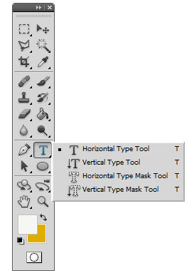
Putting text onto an image can be as easy as picking the icon and typing. Yep - that easy. But of course there are numerous options you have to make the text just the way you want it. To get started, have a look at the text flyout.

Type Flyout

Wow - four icons just to use text! The first one is easy enough so we'll start there. The Horizontal Type Tool will add text just like you normally would in any program - left to right. The Vertical Type Tool adds text from top to bottom.

Start a new image and add text using both the Horizontal and Vertical Type to it. You'll find that it is quite easy - click and start typing. This Photoshop knows that you are starting a new layer and not adding onto existing text.

When you start the command and move the cursor into the drawing space, you'll see there is a small box around the type tool's cursor. If you move close to an existing text object, you'll see the box go away - that means you can edit that text.

Paragraph Text
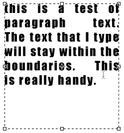
You can also create a paragraph outline by clicking and dragging to create the boundary for the paragraph. This allows you to enter larger amounts of text that can be better formatted for columns or paragraphs. It's also great if you are creating a layout (say for a flyer) and have a specific area for your text planned.

Photoshop Type Tool

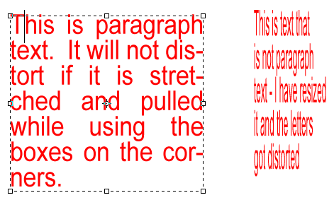
One advantage of using paragraph text is that the letters stay the same size if you resize the box. If you just do regular text (click once and start typing), if you resize the text it will distort the letter. Have a look at the image below to see how this looks.

Text in Photoshop

Formatting Text
Now that you have mastered the ability to add text to your image, it's time to make it look like you want it to. This can be done two ways. You can use the option bar at the top, or you can use the Type Palette. Below is what the option bar looks like with the type tool active.

Type Option Bar

If you have used a word processor before, some of this may look familiar. On the far left is the flyout for presets. Presets for text are handy for times when you don't want to remember which font you used for which project. The next button allows you to quickly change from vertical to horizontal text and vice versa. The left droplist give you all of the fonts installed on your computer. The next droplist shows what options are available for the selected font. Next to that is the droplist for the height of the font, measured in points (you can also manually enter a number here). After height is a list of anti-alias options which control edge sharpness. Next you see 3 series of lines that are used for justification (left, center and right), followed by the color picker. Right of the color picker is an option for placing text along a vector path (likely drawn by the pen tool you used in the previous tutorial). The last icon on the right is used for expanding the Type palette.

The style of font and type that you use depends heavily upon the end use of the image. Most people are surrounded by advertising, so next time you're out take a look what font was used by the designer of the image you are looking at. You can have the most beautiful font, but if it doesn't suit the intended use it will look ridiculous. One common rule in design is not to have more than 3 different fonts on an image or document.

Experiment with the different styles of fonts and options. In later tutorials, you will be adding text to practice projects. For now, just get used to the many options available.

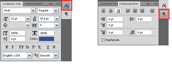
The other way of modifying your text is to use the Type and Paragraph Windows. This is shown in the image below.

Photoshop Type Palette

As you can see, many of the options that are on the option bar are available here. You also get some bonus ones!

Text Size

Adjusts text depending upon the text height in points that you select

Kerning

Changes the spacing between letters based on true measurement (metrics) or what is more pleasing to the eye (optical)

Vertical Scale

Makes the text taller or shorter, but does not affect width

Baseline Shift

Moves the bottom of the text above or below the standard placement (baseline) and is measured in points

Set the Leading

Adjusts the space between lines

Set the tracking

Changes the space between letters

Horizontal Scale

Adjusts the width of the character, but not the height

Faux Bold

Creates a bolder character for fonts that don't have a bold option

Faux Italic

Adds a slant to characters that don't have an italic option

All Caps

Makes all the selected letters upper case

Small Caps

Makes all the selected letters upper case, but smaller

Superscript

Raises the selected text and makes it smaller

SubScript

Makes the selected text smaller and lowers it

Underlines

You guessed - it puts a line under the selected text

Strikethrough

Puts a line straight through the middle of your text

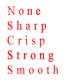
Below all those icons are two droplist's. One is to select what language set you want to use (used for Spell Check), and the other selects the anti-aliasing method. Below are examples of the different methods on text.

Anti-Aliasiing text

When you go to the Paragraph tab of the palette, you will see a set of options. These will affect how your text lines up in a paragraph. These are pretty straightforward, so just create a section of paragraph text and see how these options affect it. Consider it homework.

So, you have text, you have it formatted the way that you want it to be and half of it is off the page... select the Move Tool and move it to where you want it, by Clicking on it and Dragging.

Tip: To edit the text, make sure that the text layer, the layer that the text is on, from the layer window. Now with the Text Tool selected, click on the text and start editing. This really helps when you have multiple text layers.

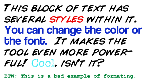
Of course, you can have multiple styles of text within the same block of text. Just select the letters, words or sentences that you want to make different and make the the changes. Here's an example of how it could look. The image below shows a single block of text.

Multiple Text Styles in Photoshop

Type Mask Tool
These tools work just like the regular type tools, but instead of creating text, it creates a mask - or makes a selection boundary out of the outline of the text. This can be used to create text-shaped marquees that you can use to edit the image with. Open up any photo. Activate one of type mask tools and create some text. Don't freak out when the image turns red - it's temporary. When you finish the text, you'll be left with a selection.

Spell Check
When you finish a design, use spell check. It could save your job. Go to the Menu and choose Edit > Check Spelling. Remember that spell check will not catch words that are spelled correctly but used in the wrong context. Check ALL your phone numbers, addresses and other contact info- twice. Don't catch the error after printing 10,000 brochures.


Conclusion
Type (or text) is used in many, if not most, graphic designs. It needs to provide a message clearly and in a format that matches the image. You need to watch out for unreadable text. Try blue text on a red background to see what I mean. Watch out for text that is too small in the final image. It may look good full size when you design it, but it can useless when you save a smaller version. It's usually a good idea not to rasterize text until you need to. Imagine that you rasterize your text, make all kind of cool mods on it, and then notice a spelling mistake. Ouch! So remember to spell check and try to get someone else to read your design before finalizing it.

Reference
Download some great fonts at this site for free
Read about typeface - the precursor to fonts


<< Previous Tutorial

Return to List

Next Tutorial >>

Owned and operated by The Art Department, Chester, NE
This web site is protected by Copyright 2008 - 2011©

Last Update:


Please visit our other sites:

| www.myARTdepartment.com | www.TheCenterofCreativity.com | CustomGamingDesign.com | FreeAutoCADTutorials.com |

myIllustratorsite.com | myAfterEffectssite.com | myAutoCADsite.com