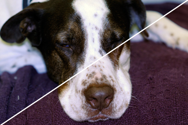
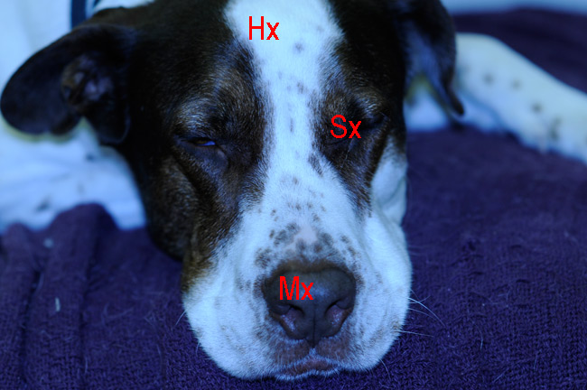
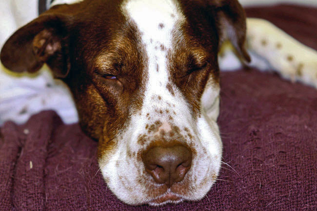
3-4 : Correcting Image ColorIntro Just as you learned in the lesson about exposure, setting the 'correct' color is up to the user. You could say that "color is in the eye of the beholder". Just because I think an image is perfect doesn't mean you will. Also, as you develop your eye, you'll look back at images you corrected in the past and wonder what you were thinking. You also have to remember that the colors you get are dependent upon the camera and how it records them. Some images can be so messed up that it's very difficult or impossible to make them perfect. The goal is to make them look their best. Since I'm just dealing with methods here, I won't mention technical things like monitor calibration and printing profiles. I'll try to cover that later in an advanced level. For now, just focus on when an image needs to be color corrected and how to fix it. Auto Color Download this photo if you don't have one to work with. Below is a photo of my dog Blue - oops I mean Buck - and the color is obviously way off. I will use Auto Color to correct the image. To do this just navigate the menu Image > Auto Color (or press CTRL+Shift+B). If you move your mouse over the image, you will see the corrections made just by pressing a single button, the Auto Color button. Wow - what a difference! And it's so easy! You can thank the programmers at Adobe for this amazing tool. In this case, Auto Color worked very well, but not perfect. If you look at the corrected image, you'll see that the shadows look a little 'cool' or towards the blue end of the spectrum. Below is an image that shows the Auto Color corrected image (top left) with further manual adjustments (bottom right)
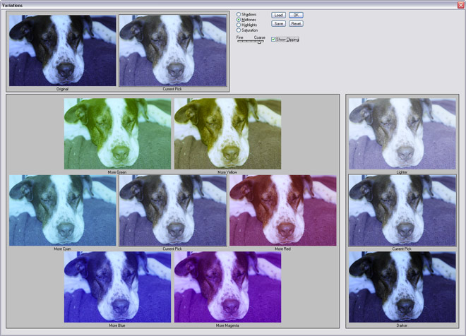
You'll notice that the color of Buck's blanket has also changed. Have a look at where his dark patches of hair blend into the white areas. In the top section, they look bluish, but in the bottom area, they look more natural. Having just looked at Buck, I will confirm that he has no blue areas on his face and his blanket is burgundy not purple. The lesson here is that Auto Color adjustments work well, but they usually need more fine tuning. Using Levels to Adjust Color This results in another acceptable adjustment. Instead of clicking once with Auto Correct, you click 3 three times in Levels. When selecting the highlights pick, you want to choose the brightest spot in the image (which should usually represent a white spot). For Shadows, you want to select the darkest part of the image (usually a black spot). The Midtones selection is the toughest. You want to pick a very neutral area that would represent a light gray. I usually select the Highlight, then the Shadow, and then poke around to find the most suitable Midtone area. This method will work on a wide range of images. It will correct your color and your exposure at the same time. Variations Here is the window that will open (click on it for a larger image) Photoshop shows you a sampling of color adjustments. To apply less or more correction, move the slider from fine (less) to coarse (more). You can also look at highlights, midtones and shadows - or just saturation. The best way to use this tool is to select midtones, then move the sliding scale to about the center. Look at the middle image, or "current pick" in the color section, if you think that it is too blue, click on the "add more yellow" image, since yellow is the complimentary color for blue. These work in the same way as in the previous tutorial 3-3 on color. Each time you click the "add more yellow" image it will add more yellow to the "current pick" image and take away more blue. If one click adds too much color, then move the slider to the left to give it a "finer" adjustment. Rarely would you want to make a coarse adjustment unless you were trying to posterize the image and there are better ways to do that. Which we'll talk about later. Once you have the image to your liking, click on the "OK" button located top right in the variations box. If you don't like the results in the full screen, "undo" (CTRL+Z).
Manual Color Balance
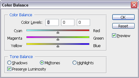
Now you see 3 sliders that allow to adjust the RGB of your image. You remember that they have opposites as well, so by removing a blue tint from an image, you are actually adding yellow. Just like above in the Variations Tool. Sidenote: I worked for several years in a Photo store that had a developing lab in it. The technicians would do their best to correct colors on images, but the customers would not always agree with their decisions. Many times a customer would say "That person is wearing a light mauve dress". I'd have to explain that the technician corrected for the skin tones to make their faces look best. If they had made the dress color accurate, then the colors in the faces would be off. The reason I'm saying this is that not all colors can be reproduced in the digital or chemical world of photofinishing. When you are correcting images, you will need to make decisions based on what is more important in a scene. There is no right answer except yours (or your client's if they complain). Now that I've told you that there isn't a right answer, you should try manually adjusting an image to improve the color. Here's how I ended up fixing Buck (poor dog). I base this on my eyesight, my monitor and how I perceive the colors of my dog and his blanket.
I got this result by using a few sessions of Color Balance as I couldn't get a satisfactory correction using it once. I did this to get subtle changes with each change. I also adjusted the exposure to get a better final image. Still, his forehead is overexposed (blown highlights) and there is a green tint to his leg due to the fluorescent lights in the room. Conclusion It's also very important to get the best color you can in the original shot this will save a lot of time down the road, so work on white balance and lighting with your camera and use less Photoshop. Reference
|
|||
<< Previous Tutorial |
Return to List |
Next Tutorial >> |
|
Owned and operated by The Art Department, Chester, NE |
Last Update: |

